vol.05MADOのある風景2022年3月4日
ポスターって大人だけのものじゃない!子どもにこそ夢膨らむポスターで、あたたかい心を育んでほしい。そんな願いからMADO(マド)は誕生しました。MADOは日本の「窓」から来ていて、「世界中の子どもたちに向けた窓であってほしい」という願いが込められています。さあ窓を開いて、世界のMADOのある風景を見てみましょう!
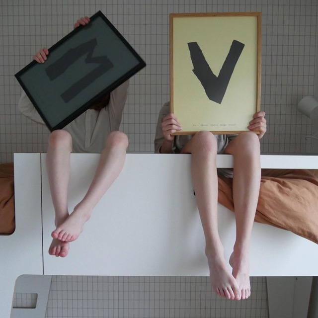
@sophieenvic
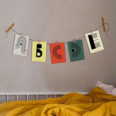
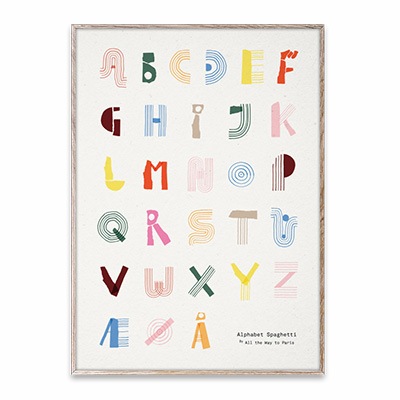
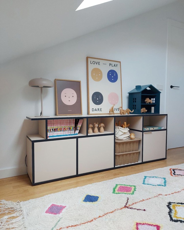
これぞMADO!というような、「Alphabet Spaghetti」を手にした子どもたち。アルファベットは子どもたちのイニシャルでしょうか…。こんな風に撮影してみたいです!
Children holding "Alphabet Spaghetti" in their hands, a very iconic picture, as if to say this is MADO!
I am curious if the alphabets are the children's initials... I'd love to take a picture like this!
@hyggeligt_hjem_
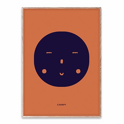
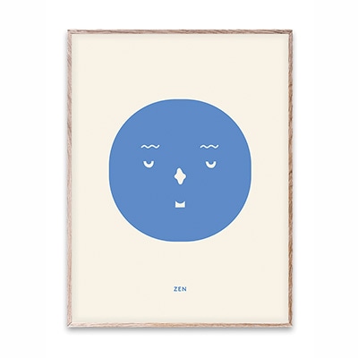
アンティークな雰囲気のお部屋に「Feelings」ポスターが。 愛嬌たっぷりChirpyとZenが良いアクセントになっていますね! 色のバランスも絶妙です。
A "Feelings" poster in an antique room.
The charming Chirpy and Zen make a nice accent!
The color balance is also exquisite.
@janka_ffm
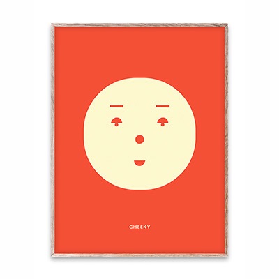
木の温もりを感じるお部屋にそっと飾られたCheeky。ちょっぴり生意気な表情がユニーク!
大人のインテリアに柔らかさをもたらしています。
Cheeky is gently displayed in a room that gives a wooden warmth.
The cheeky expression is unique and brings a softness to the adult interior.
@schiehuisje
そっくり真似したいくらい素敵なディスプレイ!なんと雑誌に載ったそう。それも納得の可愛さですよね。 モダンなAlphabet Spaghettiのポスターが空間を引きしめて良いバランスとなっています。
It's such a beautiful display that I want to copy it exactly!
I heard it was featured in a magazine. It's so cute!!
The modern Alphabet Spaghetti poster adds a nice balance to the space.
@vier.im.quartier
明るい光が差し込むお部屋に並べて飾られたSolid Shapes 01とChirpy。
深い青と大胆な構図がマッチして、白のインテリアをキリっと引きしめていますね!
Solid Shapes 01 and Chirpy are displayed side by side in a bright natural room.
The deep blue color matches the bold composition, and it really sets off the white interior!
@teoyolivia
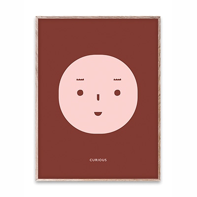
敷かれているラグの色とリンクしているCuriousとFour。
ferm LIVINGのペーパーパルプボックスと木のオブジェたちとのバランスが、可愛らしさがありつつも落ち着いた雰囲気で素敵です!
The colors of Curious and Four are linked to the colors of the rug.
The balance between the paper pulp boxes from ferm LIVING and the wooden objects creates a lovely,
yet calm atmosphere!
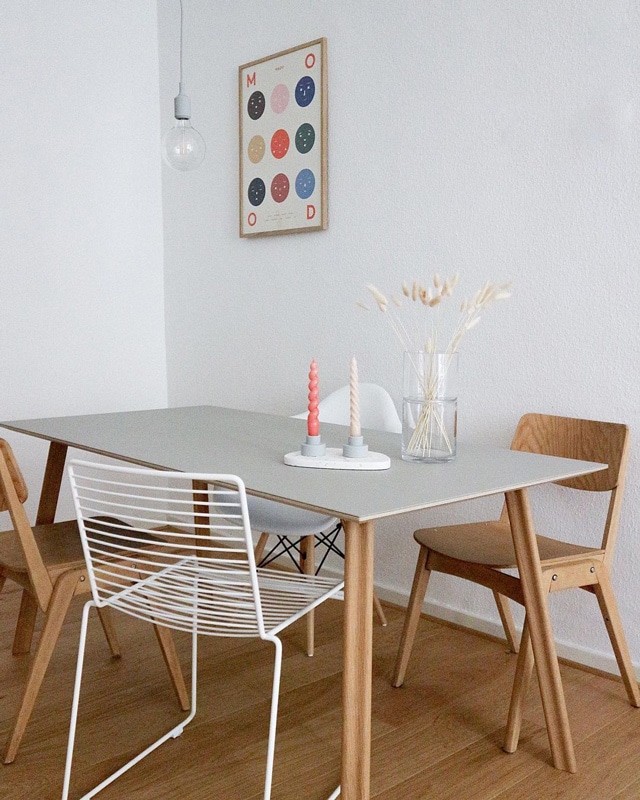
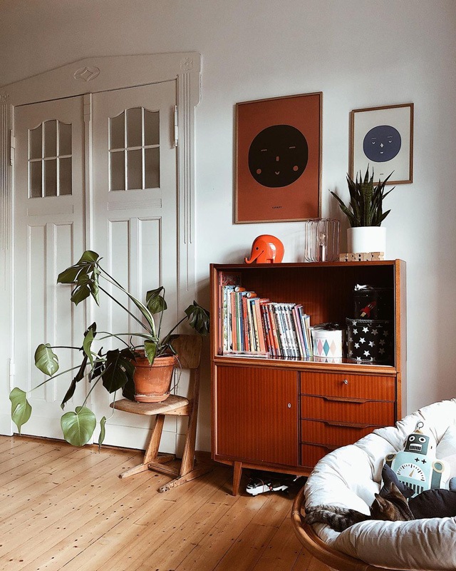
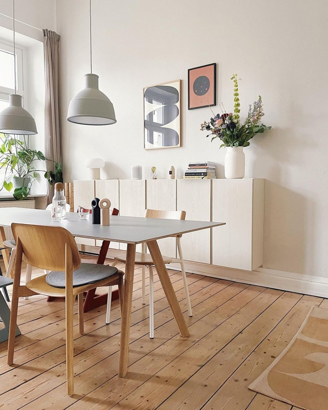
@altbau_bude
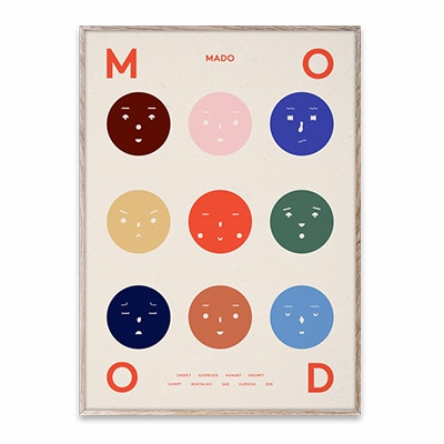
大人っぽいインテリアにNine Moodsがユニークなアクセント!
ポスター中央のオレンジ色と、テーブルに置かれたキャンドルの色を合わせているのがさりげなくて素敵です。
Nine Moods has a unique accent in this mature interior!
The color of the orange in the center of the poster matches the color of the candles on the table, which is subtle and wonderful.
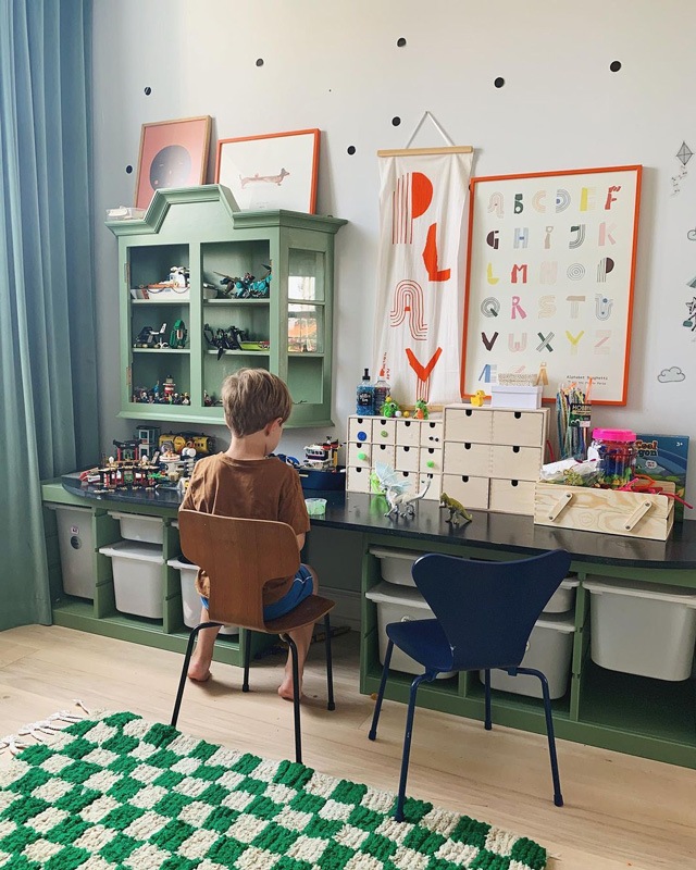
@idestrup
大好きな模型をたくさん飾った、これぞ男の子の部屋!
グリーンと相性のいい赤系のポスターが映えて、良いバランスを作り出していますね。
This is a boy's room with lots of his favorite models on display!
The reddish posters go well with the greens in the room create a nice balance.
MADOのある風景はいかがでしたか?
子どもも大人もワクワクするインテリアばかりで
早速真似してみたい!と思いますよね。
MADOはラインナップ豊富ですので、お気に入りを見つけて
ポスターインテリアを楽しんでくださいね。
この記事で登場した商品はこちら▼